Favorite Fonts: Caslon

So, Is it an oldie but a goodie or something fresh from the typographic oven?
This one is an oldie and better than a goodie. It’s Caslon!
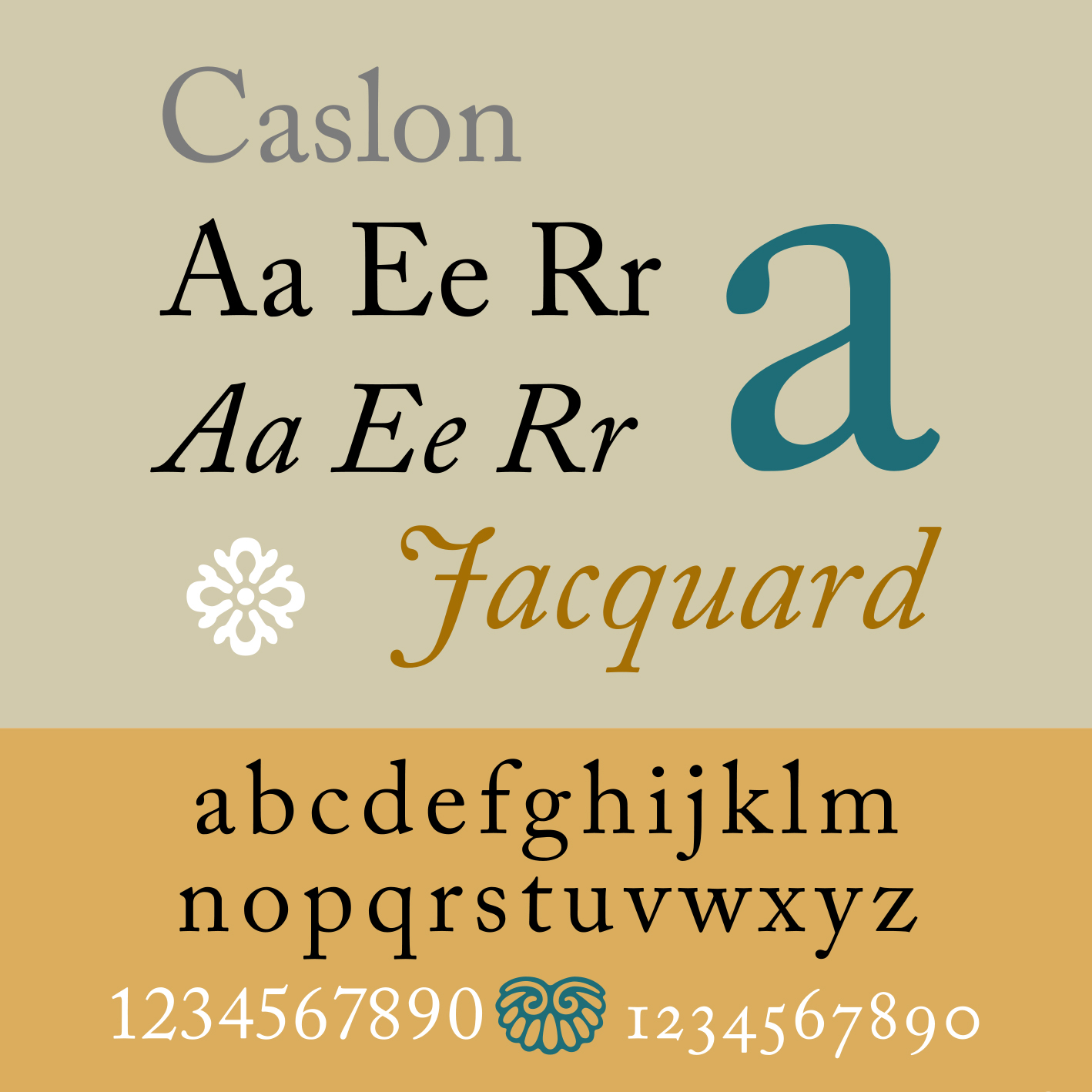
According to Wikipedia and handful of other places on the intarwebz, Caslon is the name given to typefaces designed by William Caslon the First of England, who lived from 1692 until 1766. Caslon began his career as an apprentice engraver of ornamental designs on firearms and other metalwork. He would go on to become an engraver of type, who worked in the tradition of what is now called old-style serif letter design. This style revolves around the notion of creating relatively organic structures resembling that of a handwriting with a pen. But, before Caslon established a tradition of engraving type in London, he was hired by prominent London printers to carve steel punches for printing. This technique is an exceedingly complicated. In fact, many processes would be learned in secret and only be passed within families. So, these typestyles Caslon introduced, which previously had not been common, and were influenced by the Dutch Baroque typefaces popular at the time. His typefaces established a strong reputation for their quality and attractive appearance, suitable for extended passages of text.
It’s quite fascinating to note Caslon emerged as one of the top typographic artists in all of Europe. But, as styles come and go, so too did Caslon’s typestyles. They fell out of favor for other typefaces you may have heard of like Baskerville and Didone, which would be adopted by and named for Bodoni.
Despite no longer being en vogue, Caslon remained in business and began to sell alternative and variable type designs, some cut by his son, William Caslon the Second. His grandson, William Caslon the Third would go on to establish a competing foundry.
No matter, Caslon and his son always maintained a strong reputation within the printing community. After Caslon the First’s passing, he was dubbed “the great chief and father of English type”.
Caslon regularly experiences design renaissances and reinventions, even by HW Caslon & Sons foundry in the late 19th century. My personal favorite, nonetheless, is Adobe Caslon, designed by Carol Twombly — whom you can also thank for Trajan. She was a designer for Adobe from 1988 to ’99. She referenced specimen pages from the 1730’s and 1770. She also added features now standard with high quality typefaces, like small caps and old style figures. These were not de rigeur in 1990.
And, since then, Matthew Carter—who we can thank for Georgia, Tahoma and Verdana designed Big Caslon just a couple years later in 1994. And, who did Carter design Big Caslon for? If you guessed Caslon foundry, you get bonus points! In case you haven’t figured it out, Matthew Carter is responsible for fundamental visual representation of most typeset words you see. In fact, he has the dubious distinction of being “the most widely read man in the world”, as suggested in a New Yorker profile.
Wait! Do you know what time it is? It’s haiku review time!
Old-style serif,
a typographic sheriff;
font’s melody riff.
That could have been better. It gets a 7 out of 10. Another one? Sure!
Ben Franklin’s amour.
1700’s du jour.
No need to say more.
Get the typeface where you legally acquire your typefaces. The Adobe flavor is available over at fonts.adobe.com.


