Brand Update: Maserati

Let’s talk about our latest favorite brand refresh:
Well, first off, it’s not super-new. But, it’s still new. Back in September, Maserati unveiled their rebrand. And, to the untrained eye, one might think the adjustments are quite subtle. They wouldn’t be entirely wrong. However, the logo now reflects the finely tuned and a bit more accessible offerings than the previous iteration. I’m kidding about it being accessible. The newest model starts at just over $200,000 dollars…US.
So, yeah, the lines are crisp. The points are sharp. And, the typography is more legible than ever.
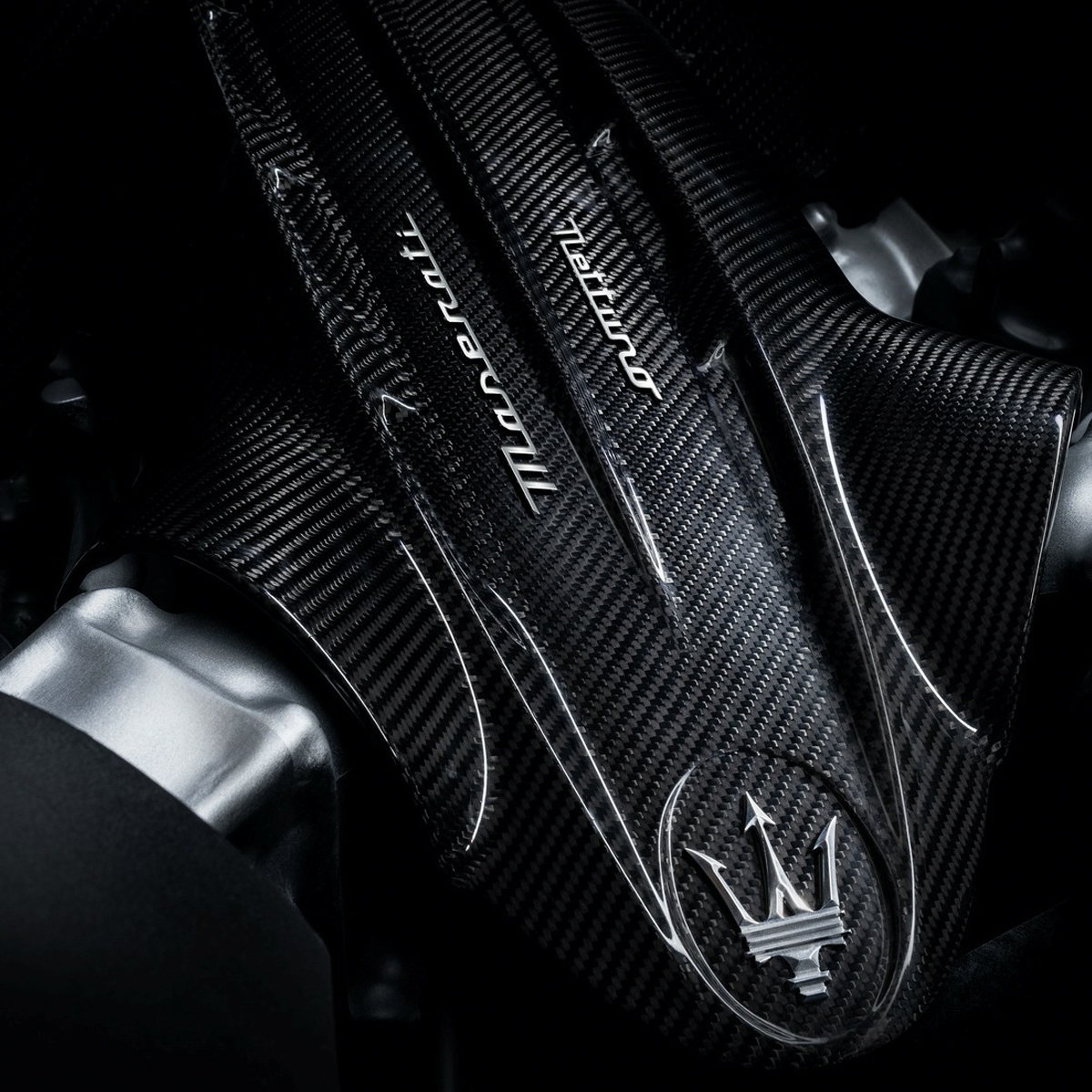
In case you’re having trouble envisioning it, the logo is comprised of a trident centered above the logotype, which is a slightly forward leaning script that emotes speed and stability.
This new logo debuted on the new MC20. It’s their newest turbocharged sports car. You can pre-order it in time for fall of next year. It’s sleeker, narrower and more graphically precise. The logo, not the car. The line weights are well-balanced and consistent. We’re talking mechanical perfection. And, the wordmark is an equally complimenting and contrasting visualization, which can certainly be described as smart and fresh. Before I begin gushing to much, let’s talk about how this logo came to be.
According to Maserati, the brand was born in Bologna Italy in 1914. About six year later, the first incarnation of the logo was crafted. In fact, one of the Maserati brothers got the idea from a family friend, the Marquis Diego de Sterlich. We first see this logo in the wild on their first fully in-house design and assembled vehicle, the Tipo 26.
Of course, in Roman mythology, the trident is associated with Neptune, a powerful god who symbolizes dominion over the sea. Well, Bologna being quite a ways away from the Adriatic Sea—I don’t know, maybe an hour and a half drive. Well, possible less in a Maserati—anyhow, the idea here is about owning your dominion wherever you go. In fact, the company moved even further inland in 1940 or so to Modena. However, the ethos persists.
The meaning goes beyond the trident and deeper with the Maserati’s signature color palette. For instance, when we see the trident juxtaposed on the deep navy blue, we aren’t just reminded of Neptune’s domain over the sea, but also his enduring strength. Sometimes, we find the logo on a white or silver color field, meant to reflect domination and perfection. Finally, the red speaks to its bold, fiery power, delivering unparalleled performance from Rome to Florence to anywhere around the world.
So, if I had to give this beautiful update a rating, I’m going to have to give it a: where precision meets performance.
How would I make it better? The typeface is almost perfection. My biggest hangup is it feels like font and not a logotype. I wish it had a bit more character. As for the glyph, it’s almost too rigid. I would love to see some more curves and softened edges. I’m a huge fan of contrasting and complementing elements. I feel like the glyph could use a bit more of both.
However, I must confess, up until now, I have never really been a Maseratti guy. But, these new lines are even on display with their newest model. Thankfully, I never have to worry about plunking down a chunk of change for one of these badboys. I’m pretty sure my wife would have something to say about that. You know, like, how are we going to pay our bills? Ok. Next topic.


