Brand Updates: Intel

Let’s talk about our latest favorite brand refresh: intel. Unveiled at the beginning of September 2020 to coincide with a launch event of a collaborative hardware development effort, a sleeker, more dynamic and elegant visual language emerged, along with Intel Evo, Intel’s 11th gen processor.
On a scale of resounding success to epic failure: Was is the good? the bad? or the ugly?
So, yeah. It’s uh … pretty good.
But, before we dive in, how about we hop in our branding time machine, and talk about how we even got here.
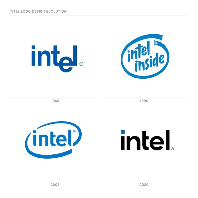
The original intel visual identity appeared back in 1968. Despite being a bit wonky, it had a lengthy 38-year life span.
Intel was founded on July 18, 1968 by Robert Noyce, Gordon Moore and Andre Grove The original Logo was created by the founders Rober Noyce and Gordon Moore in the same year. The original logo, like the latest permutation, was pure logotype. It was basically typeset in a pure bold san-serif typeface, in all lower-case. But, the letter e was dropped below the baseline, so the tail that curved out from the t became the crossbar of the letter e, which would align with the base of the letter l. Of course, this is pre-desktop publishing days. So, it was precision cut and completely custom.
Fun fact: The connection of the t, e, and l are allegedly meant to resemble computer circuitry. We are also introduced to the original trademark blue around this time, as well.
Fast-forward to 1991 when we were introduced to the “Intel Inside” campaign, which would eventually lead to the logo being uniformly adjusted company-wide to reflect this by 2006. I’ll explain. This intel inside campaign has a kind of hand-cut looking vibe with it’s custom typeface. The big deal about this is its encapsulating swoosh. We’re still sticking with blue, but, it’s become a tad lighter and a little less saturated. We still have our original logo. But, we have this extra emblem.
In 2006, they get unified. The type and the swoosh. We get a crisp, stylized – albeit dated- sans-serif, and the swoosh is no longer wrapping around the type. It is brought in so tight that it is diagonally bisected by the letterforms in the upper-left by the tittle or the dot in the letter i and the stem of the letter l. Lest we forget, we also get a new slogan: Leap Ahead. It works!
And, once again, we fast-forward almost another decade and a half to today.
The logo is cleaner than ever. The letterforms are a digitally precise semibold sans-serif, with the everything perfectly baseline aligned. The only design element has become the original square dot adorning the letter I, but only when standing by itself. In other words, if the logotype appears with a lockup like intel inside or is subordinated when we see intel evo or core i3, the logotype will be one-color, including that square dot. But, when presented on its own, the square dot gets emphasized with a contrasting color or shade. Why? It represents the company’s history of manufacturing semiconductors and microchips.
Obviously, rebrands like this don’t happen over night. This has been a longtime coming, in an effort to move beyond the Intel Inside slogan. Plus, the reveal in the midst of a pandemic posed interesting obstacles we’re not going to get into.
The brand repositioning wasn’t just spurred by need, it was inspired by a quote from the company’s co-founder, Robert Noyce: “Don’t be encumbered by history. Go off, and do something wonderful.” Since this was ostensibly the ethos that fueled the rebrand, it should come as no surprise their new positioning statement or tagline is “Do Something Wonderful.”
Oh, the color! In the late 60’s, we had a dark saturated blue. In the 90’s we got a muted lighter blue. Now, we not only have a wide ranging palette of blues, we also get brighter colors, like orange and yellow. Ok. This seems really weird, right? But, it makes sense. Colors in different cultures mean different things. And, Intel is a global brand. Plus, they’re major sponsors of the Olympics in Japan. In other words, don’t be surprised if you see a lot of red with Intel’s marketing.


