Logo History: Apple

The history of the Apple logo, like many of the origin stories out of Cupertino, is quite enchanting.
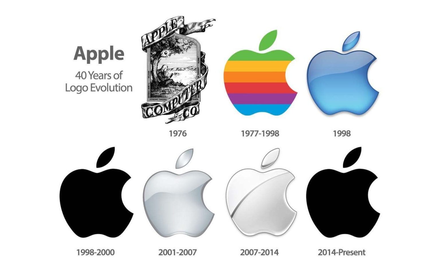
1976 – The original apple logo, which has virtually zero relationship to what you know and presumably love today, was created by Ronald Wayne, a co-founder of Apple. It was clearly intended to represent the law of gravity, and give the name justification. It’s an engraved illustration of Isaac Newton under a tree. The oddly framed engraving is wrapped with some terribly rendered and overly shadowy ribbon that’s almost medieval in nature. In the ribbon is some rather questionably rendered serif typeface that reads Apple Computer Co. Thankfully, this so-called logo didn’t last very long.
1977 – A much more graphic rendition was introduced by Rob Janoff, who worked with Regis McKenna as an art director, and was tasked to design the logo for Steve Jobs. At the time it was created, it was definitely a thing of genius. The bite mark definitely helped define it as an apple, making it rather unmistakable of other produce. It gets a bit wonky in its cleverness by adding rainbow-like stripes (they aren’t in rainbow order). The colored stripes were meant to signify the fact that Apple computers had color. Interestingly enough, each of those rainbow colors were specially created for Apple. The apple icon with which you are familiar was accompanied by a now dated logotype that only read “apple” in all lower-case.
1984 – Branding powerhouse, Landor Associates got their hands on the logo. They separated the glyph from the letterforms, and gave the brand a new typeface. Permutations of that typeface would live on for quite some time during the glyph’s lifetime.
1998 – Apple experienced a renaissance, and so-to did it’s signature apple icon. Bringing the design process entirely in-house, they turned the rainbow-ish logomark into a glassy, jelly-like, three dimensional trendy mess. As quickly as that happened, it became a solid, flat, graphic icon. Simple, yet powerful.
2001 – Apple chromified it. But, it was too chromey and not graphic enough, so they added a sliver of a reflection to disrupt the gradients.
2014 – The design went back to the one-color. This is a strikingly solid logo. Taking a queue from Nike, they dropped the logotype.
It’s worth noting, the logo mark’s original basic design structure from 1977 still remains today.


