Logo History: Bass Ale

Way back in the 1900’s, before Adobe Illustrator or even the Mac—or even before we re-appropriated the term branding from ranchers—there were the true pioneers of modern graphic design.
Today, we’re talking about Bass Ale.
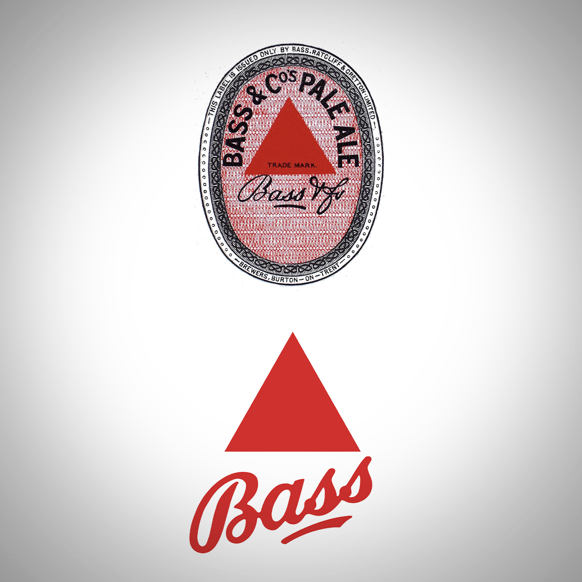
This identity fascinates me to no end. The earliest known trademark is said to be that of the Bass Ale’s red triangle, which happens to be depicted on beer bottles in Edouard Manet’s 1882 painting “A Bar at the Folies-Bergere”.
Established in 1777 by William Bass in England, the Bass Brewery grew into one of the largest beer companies in the U.K. by the end of the 19th century, with over 1,500,000 barrels of beer produced annually. Bass was even eventually included in the inaugural FT 30 index established by the London Stock Exchange in 1935, signifying the brewery as one of the top 30 companies in all of the United Kingdom.
Of course, this brand is a thing of legends. Why? Well, I’ll tell you.
The generally accepted story is that after the passing of the Trade Mark Registration Act of 1875, when applications to apply for trademark registration opened on January 1, 1876, a Bass employee was allegedly sent to wait overnight outside the registrar’s office the day before in order to be the first in line to file an application to register a trademark the next morning, and that is why the company has trade mark number one. There is no evidence for this story: but it is certainly true that a label with the triangle on it, and the words “Bass & Co’s Pale Ale” is indeed the UK’s Trademark #1 And, to that end, is listed as having been the first to be registered on New Year’s Day 1876.
Oh! You know how I mentioned it was in a Manet painting? It’s also in a bunch of Picasso’s as well as mentioned in James Joyce’s Ulysses. Yeah. Crazy, right?
So, the logo’s distinct color and the compelling—even mesmerizing—nature of Bass branding are celebrated in chapter 14 of Joyce’s epic novel. Let me read you a bit: “During the past four minutes or thereabouts he had been staring hard at a certain amount of number one Bass bottled by William Bass and Co at Burton-on-Trent, which happened to be situated amongst a lot of others right opposite to where he was, and which was certainly calculated to attract anyone’s remark on account of its scarlet appearance.”
While the red triangle, itself, persists, the logo has been considerably simplified to only include logotype that references the original scriptface in which the name Bass was typeset, along with the underline conspicuously placed beneath the “ass” part of Bass. The updated logotype is beefier, as is the underline, which is no longer seemingly emphasizing the bottom-end of the logotype. This refreshing update was completed in 2014 by Frohlich & Kent.


