Logo History Lesson: Starbucks

Way back in the 1900’s, before Adobe Illustrator or even the Mac—or even before we re-appropriated the term branding from ranchers—there were the true pioneers of modern graphic design.
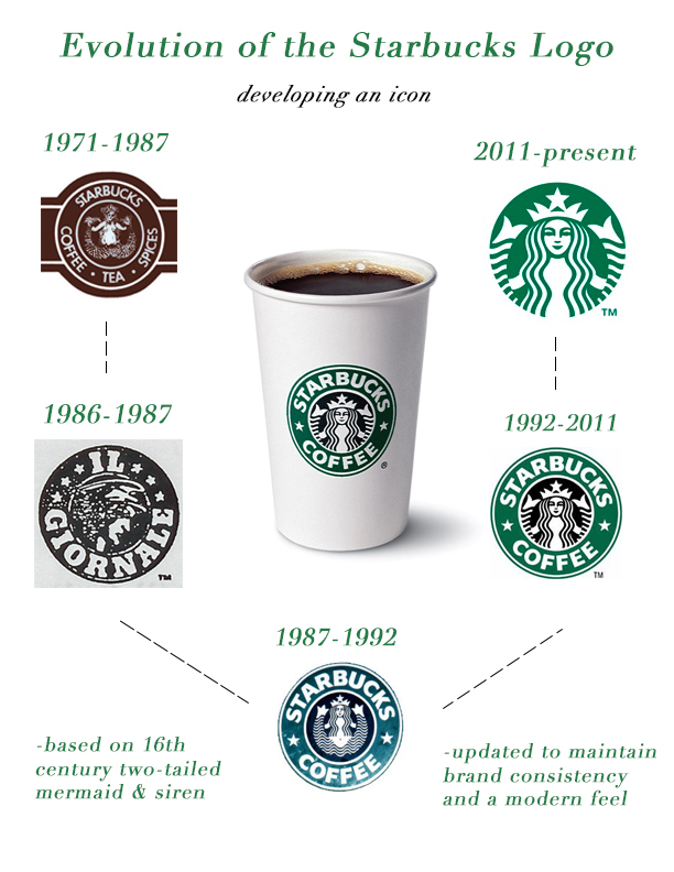
When we think of the Starbucks logo, we immediately envision a close-up of a two-tailed mermaid with an oversized crown topped with a 5-pointed star. But why?
Well, according to mashed.com, in 1962, Gordon Bowker, a college dropout from Seattle discovered his love of coffee while on holiday in Italy. Less than a decade later, Bowker would convince his roommates, Jerry Baldwin and Zev Seigel, to start what would become the world’s largest coffee brand.
The company was evidently destined to be named after a character from Herman Melville’s Moby Dick. In fact, Bowker wanted to call it by the name of Captain Ahab’s ship. But, they opted to name it after the calmer first mate, Starbuck, because their marketing partner rightly thought that was the best option. Could you imagine getting your coffee from Captain Boomer’s?
Once they had a name, they needed a visual identity. Their image began with what would later become a controversial image. We use this term very loosely, because it was basically taken from an existing illustration. The so-called controversial aspects are a bit wide-ranging. First of all, you have theorists calling it a symbol of the illuminati or a Zionist plot. Secondly, you have the overly pedantic noting the founders messed up when they said it was a norse woodcut. They were told it’s really Nordic. However, it appears it’s actually Germanic. So, no surprise these pseudo-intellectuals were wrong. Lastly, people complained the twin-tailed mermaid was likely that of an inland spring-maid, as opposed to an actual mermaid. It’s worth noting, there is no scientifically documented creature. Nonetheless, Seattle is between Lake Washington and Puget Sound. So, maybe they didn’t mess up after all.
The logo’s history goes a bit further to pacify the natives. In case you’re not familiar with the original Starbucks logo, this twin tailed mermaid is topless. That’s right, it has boobies. Oh no! Well, for some crazy reason, people were up in arms over this. After all, the whole point was to reflect the allure of coffee.
Lucky for the outspoken prudish types, the logo needed to be re-illustrated, so it could be enlarged enough to be emblazoned on the sides of delivery trucks. And, thus, the contemporary version of the illustration was born with a new hairstyle for improved modesty and a simplified and modernized design style. Some liberty is being taken here for the sake of brevity.
And, in order to quickly wrap up the story, the guys who founded the company would sell their shares to Howard Shultz, the salesman who would grow Starbucks to epic proportions, making its name ubiquitously synonymous with coffee. He’s really responsible for the visual identity we know today. It was kind of a merging of designs and color.
As for the founders, they would go on to have a stake in Peet’s Coffee, now part of a megalithic holdings company responsible for brands like Mighty Leaf Tea and Jimmy Choo. Suffice it to say, things turned out pretty well. Now, the guys are on boards of directors, serve as advisors, etc. Jerry Baldwin even owns a California vineyard, and Zev Seigel is even a motivational speaker.


