Brand Update: Heinz

Let’s talk about a recent brand refresh: Kraft Heinz.
On a scale of resounding success to epic failure: Was it good, bad, or ugly?
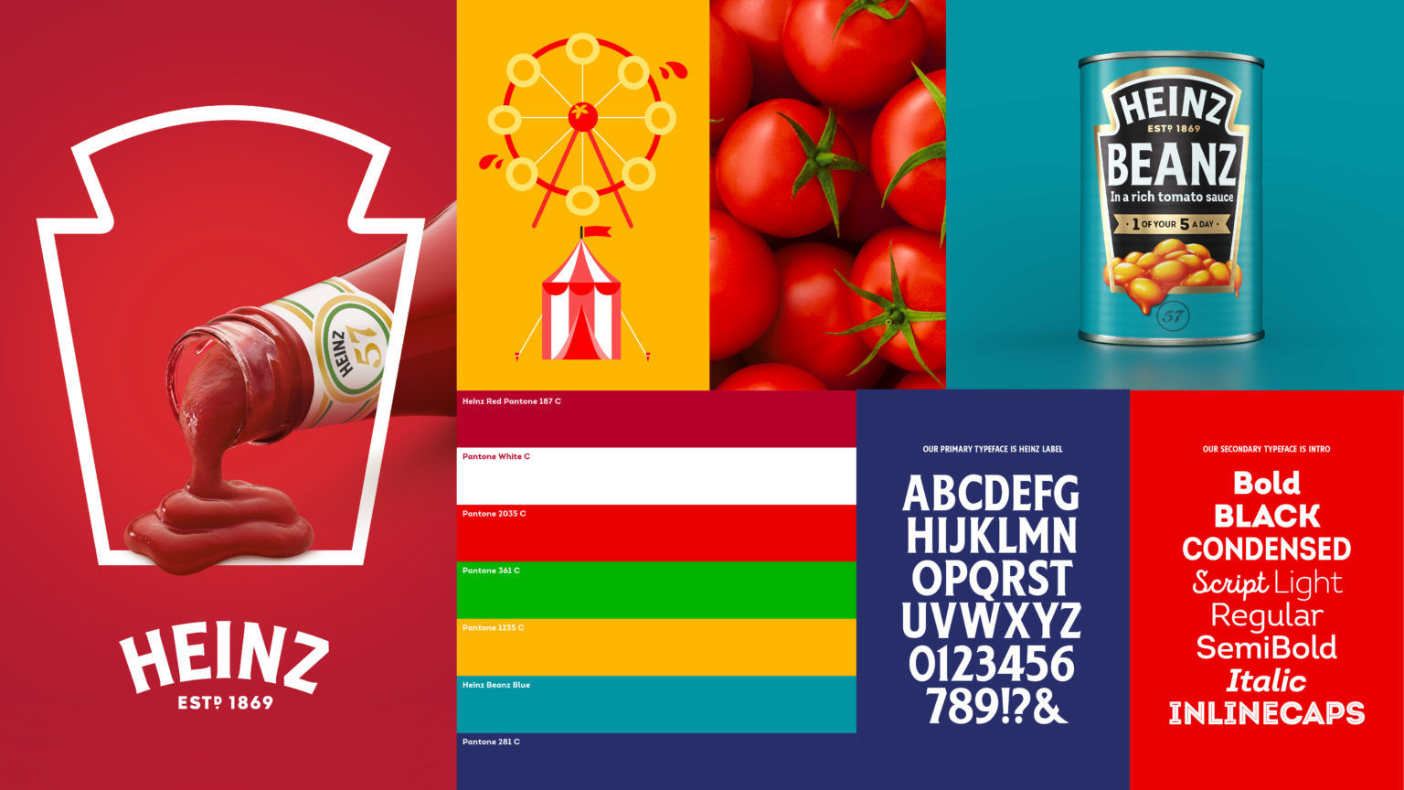
Jones Knowles Ritchie, the creative agency that handled the rebrand, absolutely killed it. They managed to unify incredibly distinctive elements – from Heinz’s logo and keystone shape, to the color palette and typefaces. Every single touch point of the brand has personality, that isn’t over the top. Simultaneously, it has moments of elegance and sophistication. It is a brilliantly accessible brand language that exudes thoughtful cohesiveness.
Could the designs still be improved? The brand does meander a bit from product to product. While differentiation is nice, to be truly cohesive, the determined design formula should be closely followed. When breaking the rules, be consistent about how those rules are broken.
All-in-all, the tone and presentation is lovely. The brand refresh is a family of close relatives and distant cousins that can all get along well at their next reunion.
Listen to the whole episode, wherever you listen to your favorite podcasts!


