Brand Update: New Holland Brewing

Let’s talk about the latest favorite brand refresh: New Holland Brewing.
It all starts in Holland, MI, on the shores of Lake Macatawa, very close to Lake Michigan. There is a really old windmill called the De Zwann, in what is now a bit of a tourist trap called Windmill Island Gardens. Holland is also home to the Tulip Time Festival. This place is steeped in Dutch heritage.
In the late ‘90’s, Brett VanderKamp started New Holland Brewing. The logo was kind of grungy, hand hewn serif typography and oversized flanking letters stretching beyond the ellipse. Windmill panels and illustrated wind seemed to be busting out of the design.
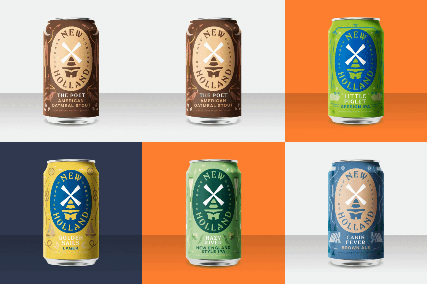
The rebrand is spectacular. Adam Dickerson, their brand manager, is touting this dutch word “Gezellig”. This word supposedly captures the spirit the brand is meant to convey: innovative, welcoming, resourceful, cozy, friendly and relaxing. The new design encompasses all of that.
Rather than being a background element, the windmill is now front-and-center. It’s clean, it’s elegant, and it’s iconic. It’s a really lovely interpretation of the old De Zwaan windmill. The typography has so much personality and character. But, it remains sophisticated. They have truly managed to create a classic, timeless, yet modern brand language.
Of course, since we are all averse to change, how can it be improved? There is a little bit of weirdness to some of the lettering of the primary logotype. There are some strange nuances that only happen on half the letters, and there’s some inconsistency in the weights and curves. Perhaps that’s what gives it some of the charm that’s so endearing? Regardless, let’s drink to this well executed brand refresh.


