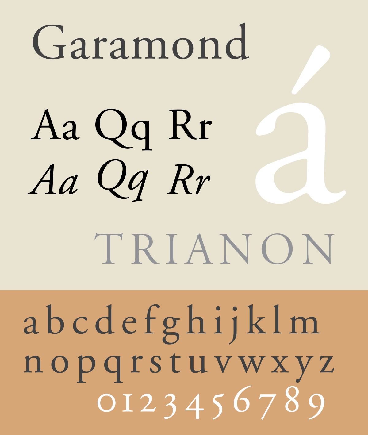
Favorite Fonts: Garamond

The renowned Parisian printer Claude Garamond was a driving force behind typeface creation during the Renaissance period in the sixteenth century. His most famous (and inspirational) typeface was cut early in his career for the French court – specifically King Francis I – and was based on the handwriting of the king’s librarian, Angelo Vergecio. The earliest use of that font was in the production of a series of books by Robert Estienne. Robert Granjon, another very famous influence on typography, started as an assistant to Garamond. Most modern versions of the Garamond typeface, including the Adobe Garamond design, base their italic type on Granjon’s lettering. See it at brandshowlive.com, as well as anywhere Google says you can legally obtain it. Robert Slimbach’s interpretation, Adobe Garamond, is particularly nice and is available through Adobe Fonts.
Haiku Reviews
Ancient, yet modern.
This 1500’s old-style
Serif still holds up.
1540s font:
comes from a typeface savant—
A serif gallant.


