Favorite Fonts: Gotham

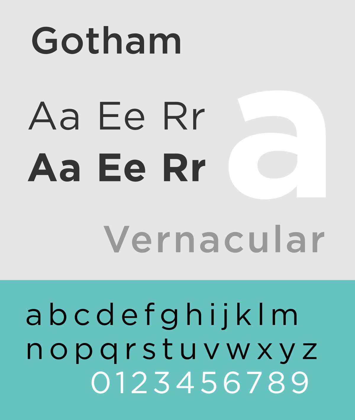
The latest fave is relatively new. It’s Gotham! This font family is pure royalty. It is quintessential typographic perfection, it has a sordid history full of drama and intrigue. See the typeface for yourself on our instagram or website: brandshowlive.com, as well as on Hoefler & Company’s website: typography.com.
This typeface was designed by Tobias Frere-Jones, with a little collaboration from Jesse Ragan. Frere-Jones is from Brooklyn. He received a BFA from RISDe. Soon after, he joined font bureau, where, among other notables, he created the Interstate typeface. To say he is a typographic ninja would be an understatement. His fonts just sneak up on you, and smack you on the eyeballs. They’re amazing. Frere-Jones now has his own workshop and is a professor at Yale. Ragan was one of Frere-Jones’ protegés. He created some killer typefaces himself, including Sentinel and Archer, as well as the logotypes for Glade and USA Today.
Gotham is a geometric sans-serif typeface family. Gotham’s letterforms were inspired by examples of architectural signage of the mid-twentieth century. According to the font’s foundry:
Gotham celebrates the attractive and unassuming lettering of the city. New York is teeming with such letters, handmade sans serifs that share a common underlying structure, an engineer’s idea of “basic lettering” that transcends both the characteristics of their materials and the mannerisms of their makers. These are the cast bronze numbers that give office doorways their authority, and the markings on cornerstones whose neutral style defies the passage of time. They’re the matter-of-fact neon signs that emblazon liquor stores and pharmacies, and the names of proprietors plainly painted on delivery trucks. These letters are straightforward and non-negotiable, yet possessed of great personality, and often expertly made. And although designers have lived with them for more than half a century, they remarkably went un-revived until 2000, when we introduced Gotham.
Haiku Review
No nonsense, urbane,
sophistication, insane
typeface shall remain.
Strong, smart and fetchin’.
Hoefler leaves zero kvetchin’.
Taste of perfection.


