Logo History: UPS

A logo history lesson about the evolution of the UPS logo.
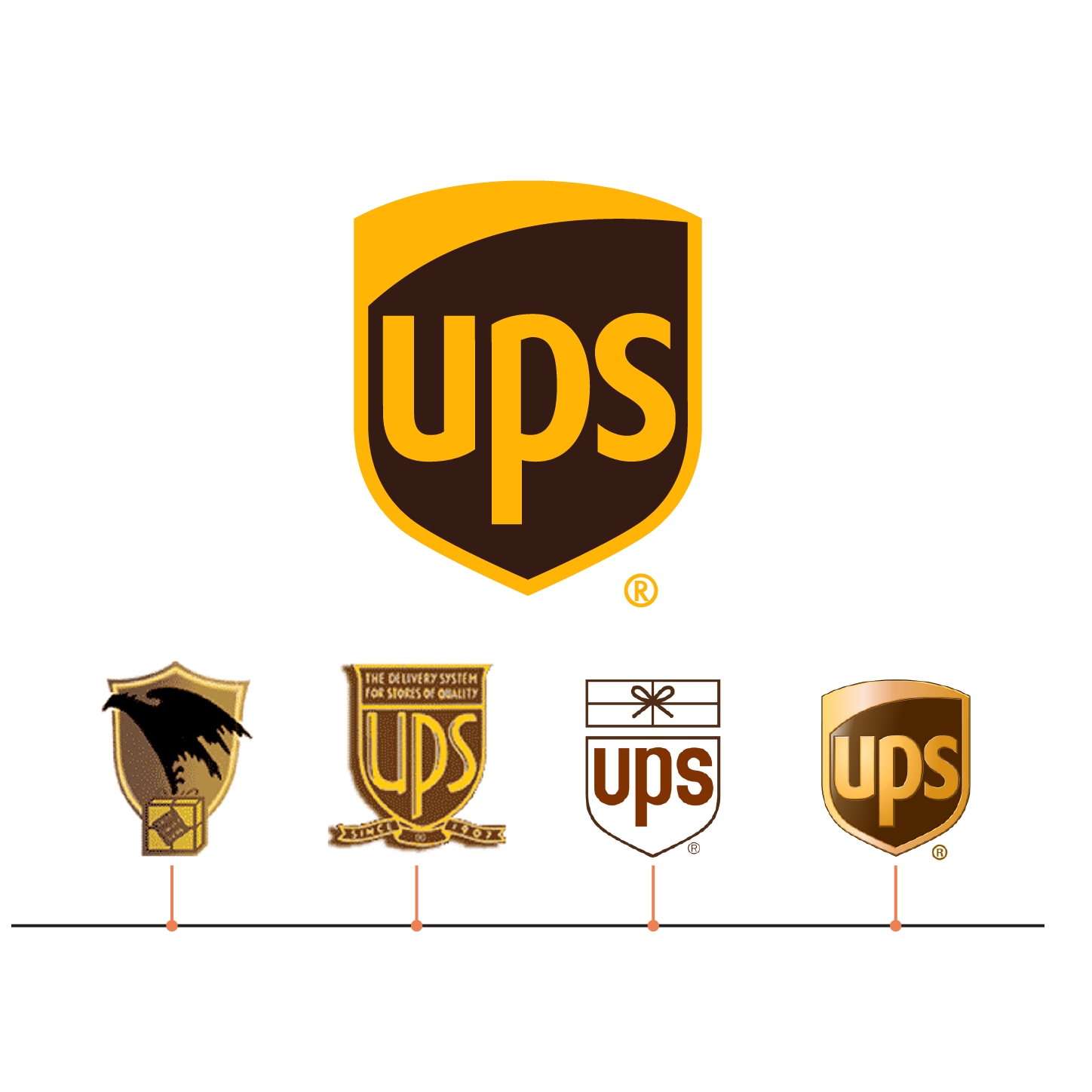
- 1916 – The first iteration was created by the founder of UPS. On the classic shield form, it featured an eagle very similar to the one that later appeared on the USPS logo in 1970. The eagle was carrying a wrapped package.
- 1937 – The eagle and package were removed from the logo in favor of a shield featuring text only.
- 1961- Prolific designer Paul Rand developed a logo for UPS that would hold steady for 42 years. His version told you what the company did in a supremely simple fashion – a simple package, above a simple shield, featuring simple typography – while still having character and being personable.
- In 2003, branding agency powerhouse FutureBrand reimagined Paul Rand’s design. They contributed a three-dimensional effect, a customized lower-case sans serif typeface, and removed the package once again.
- In 2014, it was decided to return to a more simple, flattened two-dimensional appearance again.
The logo you see today hasn’t changed since those adjustments in 2014. It is a simple shield that is rounded at the top, with straight edges that taper to a sharp point. Contained within the top arc is a slight swoosh of gold that blends with the same colored stroke that edges its way around the shield. The remaining background is a dark, chocolatey brown, with lowercase letterforms “ups” displayed. The design is classic. It still has a nod to Paul Rand, but it also has a contemporary vibe that gels with the history of the brand.
Enjoy the whole episode wherever you listen to your favorite podcasts!


