Brand Update: Fisher Price

On a scale of resounding success to epic failure: Was it good, the bad, or the ugly? It’s not good. It’s fantastic!
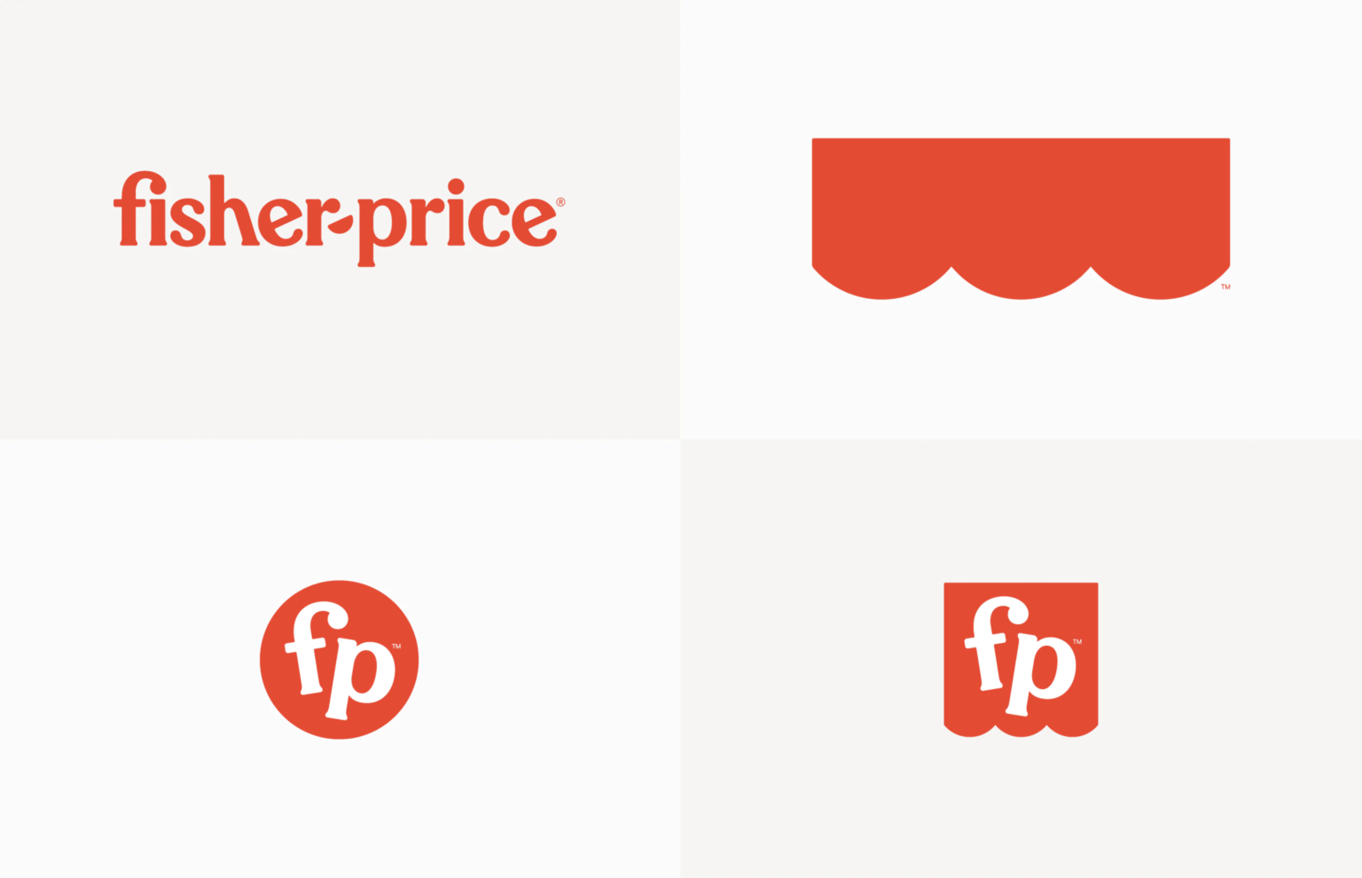
Emily Oberman of Pentagram gave the logo a beautiful update. While it is still comprised of the stylized white logotype encapsulated inside a red scalloped awning, it feels like its meaning has been lifted even higher. In fact, the bottom edging is now 3 circular edges instead of the original four, as a nod to the founders: Fisher, Price, and Schelle.
The logotype has retained some of its original character, which has been accentuated with slightly more emphasized serifs. To add to its playful nature, the capital letters have been switched out for a lower-case F and P. The f also has a lovely ligature with the title of the adjacent i. The coolest part might be that the hyphen has been replaced with a semicircle – emblematic of a youthful smile. Some much-needed air around the logotype has also been added. It is sophisticated, yet playful. It’s contemporary, yet classic. It’s fun for the whole family.
Perfect is subjective, so how could it be improved? Well, a brand goes a bit deeper than its logo. Pentagram’s triumph generally continues with the brand’s entire design system. However, it gets a bit cumbersome and a little too “ice cream shop” with the submarks and extraneous design elements. While the bouncy typeface makes sense, the undulating baseline with such a graphically precise and beautiful custom typeface is a bit odd. If it feels forced, it probably was. Usually this kind thing happens when someone inserts their opinion when they should just leave it to the professionals.
Nonetheless, the brand is really full of joy and brings about smiles.


