Brand Update: New Holland Brewing
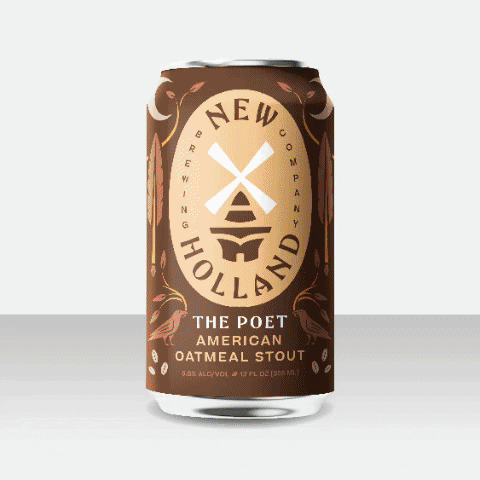
Let’s talk about the latest favorite brand refresh: New Holland Brewing. It all starts in Holland, MI, on the shores of Lake Macatawa, very close to Lake Michigan. There is a really old windmill called the De Zwann, in what is now a bit of a tourist trap called Windmill Island Gardens. Holland is also…
Read MoreWisdom Nuggets: What Makes Work Great?
So, what makes work great? We designers all aspire to do amazing, portfolio-worthy work. However, sometimes something, or worse someone, takes the wind out of our sails. When I first began cutting my design teeth, I was ever-the-optimist. In fact, I was so prolific and so inexpensive, every single client appeared to love what I…
Read MoreLogo History: Nike
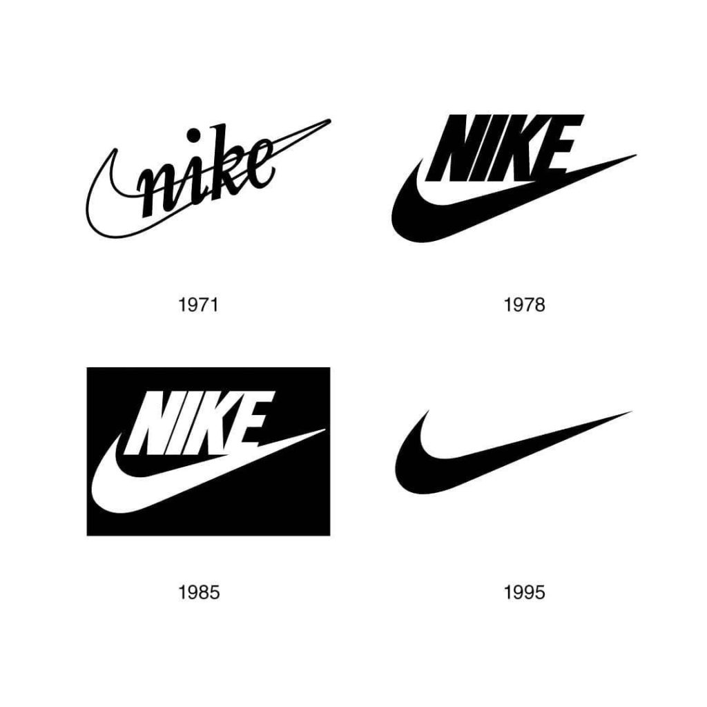
According to a scientific study from 2015, published in Inc. magazine, one of the most memorable logos in the U.S. is Nike. Nike is a brand of legends. How did it all start? The Nike logo has an incredible story. Phil Knight owned a company originally called Blue Ribbon Sports. He was also an accounting…
Read MoreFavorite Fonts: Garamond
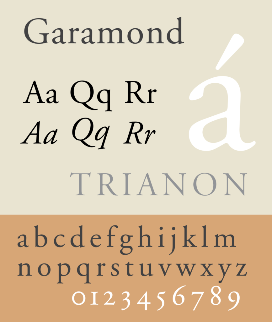
The renowned Parisian printer Claude Garamond was a driving force behind typeface creation during the Renaissance period in the sixteenth century. His most famous (and inspirational) typeface was cut early in his career for the French court – specifically King Francis I – and was based on the handwriting of the king’s librarian, Angelo Vergecio.…
Read MoreBrand Update: Fisher Price

On a scale of resounding success to epic failure: Was it good, the bad, or the ugly? It’s not good. It’s fantastic! Emily Oberman of Pentagram gave the logo a beautiful update. While it is still comprised of the stylized white logotype encapsulated inside a red scalloped awning, it feels like its meaning has been…
Read MoreWisdom Nuggets: Dealing with Toxic Clients
What makes a branding client toxic? They generally are the ones wanting your service to be cheap, fast, and good. They are especially focused on being cheap – without sacrificing quality or expediency. A client like this might start out looking for a cheap logo, and slowly creep towards abusing the scope of the relationship.…
Read MoreLogo History: UPS
A logo history lesson about the evolution of the UPS logo. 1916 – The first iteration was created by the founder of UPS. On the classic shield form, it featured an eagle very similar to the one that later appeared on the USPS logo in 1970. The eagle was carrying a wrapped package. 1937 –…
Read MoreFavorite Fonts: Decimal
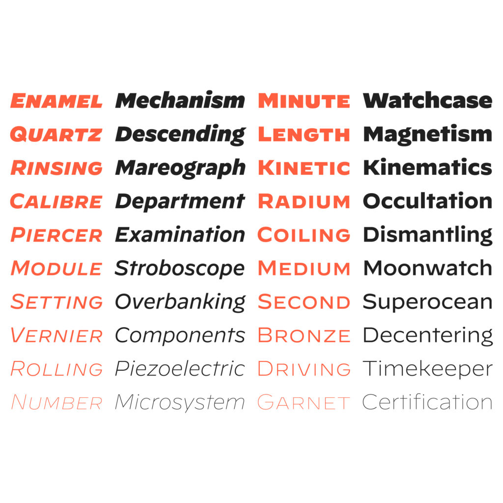
Decimal is a font designed by type foundry Hoefler & Company. According to their website, Decimal is inspired by how wristwatches once shared a distinctive form of lettering. You can actually watch how it was made in the Netflix original series Abstract: The Art of Design, Season 2, Episode 6. Haiku Review – Decimal by…
Read MoreBrand Update: Heinz
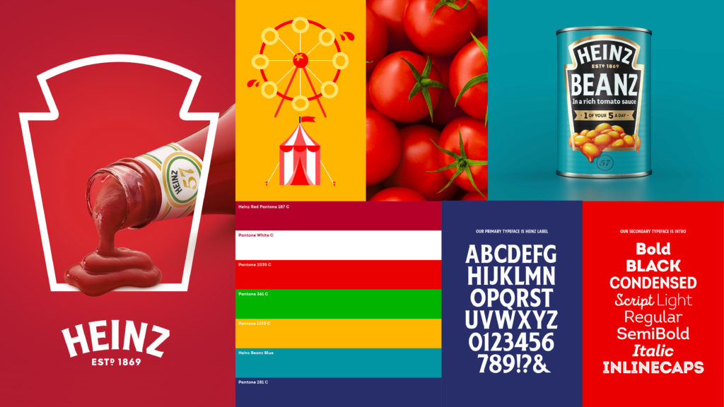
Let’s talk about a recent brand refresh: Kraft Heinz. On a scale of resounding success to epic failure: Was it good, bad, or ugly? Jones Knowles Ritchie, the creative agency that handled the rebrand, absolutely killed it. They managed to unify incredibly distinctive elements – from Heinz’s logo and keystone shape, to the color palette…
Read More